Quote of the day:They say that love conquers all. Maybe,
but *I* haven't lost faith in armored
divisions with awesome firepower coupled
with total air and naval superiority.
(Maurizio Mariotti)

Friday, July 8
Art
I have officially decided that the banners, buttons, <hr /> bars I made for this site is art. Don't ask why, I don't know. I was just playing with animation programs.
As ya'll know by now the only thing I didn't make is the flag and the firefox/thunderbird buttons. Well, and the pictures.
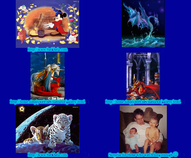
I think I'm gonna take the firefox, thunderbird and flag images and pop them off the page like I did when making the hatemail, blogs gone wild and the lyrics 007 buttons/banners. They just don't match. I just love the micki header I made. I come back and just watch the animation. I'm so proud of that. The little mickey dot I have moving around on it, I got from a site that had free mickey graphics on it. Links are at the bottom of the sidebar. I took that image into one of my graphics program and resized it. Then into paint to change the colors to the maroon and gold I have for my background and text color. If you have firefox, you can right click and choose view image to see what I actually did to make it blend into my page. All of the buttons are made that way. If I ever decide to choose a different background color or text, I'll have to change everything. Wouldn't blend anymore. The symbols that I have on the bars and header are just text. I swear it. I printed out, a while back, a cheat sheet with all the symbols on it. Wingdings 1 and 2, webdings 1 and 2. If you are going to do any kind of graphics, that's a thing you should do. Makes searching for little pics for things easier. Even the animated mailbox on my e-mail button is text. There are no 'real' graphics on anything other than the little conductor mickey on my header. Everything else is text.
I gotta tell ya, creating banners, bars and buttons is great fun. There are a few free programs, some trial ones too that are great for this. I'm still learning animation, but the 'tween' thing is awesome! Makes animating so much easier. Remember the trashman button I made? He put it on his site. That is soooo awesome. It's animation is a little jerky in the first few frames, but not really that noticeable. Being a perfectionist, I had to weigh doing it all over again or leaving it be. It would have taken forever to redo, so I decided to be happy with it. I really like making new buttons and animations. I'd do it for anyone that asked, but I really think, should anyone want one, you really should go with blogs gone wild. His art inspired me to learn how to do it. The prices are very low and his artwork is awesome! It's amazing with all the sites he's done for people, each site matches the owners' personality. I've never seen 3 column blogs look better than after he messes around with them. I absolutely hate having to scroll over to see a sidebar or post.
Amazingly enough, after my trial and error with my template, even smaller screens see my blog perfectly fine. I have my maincolumn and sidebar on float:right and float:left. It seems to me that is what makes it easy for smaller screens to see it.
Reminder to those who stumble here: these graphics, I made especially for my site. They will not work for yours. You would have to set up your blogs CSS to be the exact coding of mine. My graphics are a certain px size. They are also a certain #web color number code. If you are going to try to steal them, not only is that rude, they probably won't work. They are exact sizing.
For those who like to expiriment with their templates: Please, PLEASE have your maincolumn load before your sidebar. Counters and other add-ons sometimes do not load properly. After all the code in them tells your sidebar to get the info from another site. Sometimes, they are down or not working properly. If your sidebar does not load properly your main column WILL NOT LOAD. So...in your CSS, make sure that all of your main column { } information is above anything having to do with sidebar information. In the html coding, make sure of the same thing. In actuality, I really do not know what makes the sidebar load first, but of a few of the sites' page source viewing tells me this may be what the problem is. Initially, people come to your site to view the posts in them, not the sidebar.
Remember, except for the CSS coding, I learned everything I know from se7en. He does the blogs gone wild thing. Take a look at at the site, I swear you'll love it! He also taught me how to mess with the haloscan template. Even with a free account you can mess with it. My haloscan, if ya'll wanna take a look matches my site. The only thing I could not change is the size of the table and the haloscan advertising. Even the submit and preview button has the text in maroon. Remember if you come across something you like, view the code. Code is free, no one can own it. That's not to say that the graphics ever are. Make sure that any graphic you see is NOT ©. It's not nice to steal others' graphics or bandwidth. Ask for permission unless there is EXPLICIT permission to use the graphic. Explicit means it says: 'anyone can use this graphic for their site, save the image to your computer and upload it to your own site. Also note whether or not the site says you must link back to the page you got the graphic from. This is what keeps free graphics free and available for our personal websites.
Lecture over. Have fun ya'll. |


Unicorn. Edited to match the page.


