Quote of the day:They say that love conquers all. Maybe,
but *I* haven't lost faith in armored
divisions with awesome firepower coupled
with total air and naval superiority.
(Maurizio Mariotti)

Tuesday, April 5
Templates, HTML, and new images
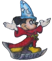
As you can see I have changed the template. Took a lot of tweaking to get it right. When I change templates, I save the one I'm using first then copy/paste the one with the layout I want. Took me quites some time to get the sidebar where I want it. Would like to have the sidebar text a color you can read over the Mickey pic. Suggestions to go well with the gold would be welcome. I may try silver or copper, just thought of that. I want Mickey to scroll with the page. For now the background color is white. I don't like it. I will be changing the background colors, let me know what you like. Changed the h1,h2 settings. Titles to my linkage stand out more. Just rearranged settings, should have thought of that before. Got the text about the size I want it. I usually have my browser set to view small text size comparable to Internet Explorer. If it's too big, let me know. I have firefox, won't use IE. If it's too small, well you can use view...text size...larger. I like smallness. This is why I only have a few posts on the main page. Right now it's set at show 2 days. Thinking about changing it to 2 posts. Came up with new names for the generic post lists. Feel free to suggest better ones. The webapp counter reads 1 reader, etc. I'd like something better, but don't know what word to use. I will be looking for an image for my e-mail me link. If you don't see one or know where to get one that's better that would be great. I'll just save and upload it to my geocities site. That's how I did mickey on the background. Resized him in paint. I have some cute little divider bars I'd like to use, like the ones between posts but I don't know how. Anyone that can tell me, that would be awesome. I have a really cute Lego line, I know it doesn't go with mickey but I'd like to use it anyway. Constructive criticism and suggestions are asked for, feel free to give.
Thanx. |
Thanx. |


Unicorn. Edited to match the page.


